Starting with ASP.NET 2.0, all data-bound controls support data source components for fetching, but only a few of them are designed to use data source components for other operations such as insertion, deletion, and update. For example, the GridView control is just a smarter version of the DataGrid control that, among other little things, fully supports the new data binding model. Designed to render tabular data, the GridView is partnered by DetailsView and FormView that render out the content of a single record at a time.
In ASP.NET 3.5, the family of “view” data-bound controls has a new addition – the ListView control. In actual fact, the ListView control fills a gap. There’s no control, in previous versions of ASP.NET, for iterating data templates for all the records in a data source. ASP.NET provides Repeater and DataList controls, but they only support data source components for fetching. The ListView control can be considered as an enhanced version of the DataList control that fully supports data source components. In this article, I’ll provide a developer’s perspective of the control, and show in action both its obvious and less obvious capabilities and features.
At a Glance
The primary aspect of the ListView control is that it allows you to take full control of the user interface via templates and properties. As a developer, you can control any HTML markup that the control outputs, without being bound to any predefined schema such as a form or a grid view. Unlike any other controls in ASP.NET, the ListView is designed to leverage an external component for paging and sorting. This component is the DataPager control added in ASP.NET 3.5. The ListView is currently the only control aware of the data pager standard interface. Finally, the ListView lacks the usual dozens of style properties that characterize many ASP.NET controls, but this doesn’t mean you can’t add any style to the output. The output of the ListView control can be styled at leisure but only using CSS style sheets directly on HTML elements and without the intermediation of ASP.NET themes.ListView Layout Essentials
As mentioned, the ListView control doesn’t force you to stick to a predefined layout – be it tabular, grid, multi-column. Likewise, it supports no header or footer template. The ListView features just one template for the structure of the resulting markup – the layout template. If you need a header or footer, you can easily place them in the layout. At the same time, a unique layout template makes it easier to develop the layout horizontally or in tiles. The layout template, implemented through the LayoutTemplate property, is mandatory in any ListView control.<LayoutTemplate> <div runat="server" ID="Body"> <!-- Templates of data-bound items --> <div> </LayoutTemplate>Instead of the <div> tag which renders out a block, you can use a <span> tag if you want the output to flow with the rest of the page. The layout template must contain a server-side element that acts as the insertion point for the templates of bound items. This can be an HTML element decorated with the runat attribute, or an ASP.NET server control. The final output is given by the layout template expanded to contain item and alternating item templates.
Because the layout template may contain a variety of elements, both server and HTML literals, you need to pass the ID of placeholder element to the ListView. You do this by using the ItemPlaceholderID property.
<asp:ListView runat="server" ID="ListView1"
	ItemPlaceholderID="Body">
	<LayoutTemplate>
		<div runat="server" ID="Body">
			<!-- Templates of data-bound items -->
		<div>
	</LayoutTemplate>
</asp:ListView>
The LayoutTemplate property alone is not enough to generate an acceptable and data-driven output. At the very minimum, you must indicate content for the ItemTemplate property, or the GroupTemplate property if you’re looking for a tiled output.
The item template is the place where you physically bind to data fields. In this regard, the ListView control is not different from other ASP.NET data-bound templated controls. To bind to data, you use ASP.NET <%# … %> data binding expressions. In the data expression, you place the Eval method for read-only access, or the Bind method for two-way data binding.
Building a Table Layout
Among other things, you can use the ListView control to build a tabular layout. The ListView is just perfect to fill in the gaps left by the GridView control – the first option whenever you need a tabular layout. With a ListView control, it is easy to arrange a custom tabular layout where you have, say, two rows per record. Getting the same result with a GridView is not trivial. Why is this? The ListView exposes its overall layout through the LayoutTemplate property, whereas the GridView control hides it entirely and only exposes a collection of GridViewRow objects for you to bind and customize. The listing below shows the markup code for the ListView in Figure 1.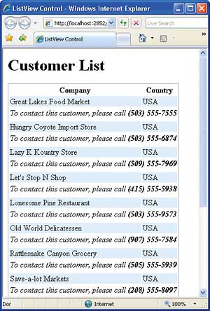
Figure 1: A customised tabular layout in a ListView control
<asp:ListView ID="ListView1"
	runat="server"
	DataSourceID="ObjectDataSource1"
	ItemPlaceholderID="ListViewContent">
	<LayoutTemplate>
		<div>
			<h1>Customer List</h1>
		</div>
		<div>
			<table id="customerTable">
				<thead>
					<tr>
						<th>Company</th>
						<th>Country</th>
					</tr>
				</thead>
				<tbody>
					<asp:place.holder
					runat="server"
					id="ListViewContent" />
				</tbody>
			</table>
		</div>
	</LayoutTemplate>
	<ItemTemplate>
		<tr id="mainCustomerLabel">
			<td>
				<asp:Label runat="server"
				ID="lblCompany"
	Text='<%# Eval("CompanyName") %>' />
			</td>
			<td>
				<asp:Label runat="server"
				ID="lblCountry"
		Text='<%# Eval("Country") %>' />
			</td>
		</tr>
		<tr>
			<td colspan="2">
				<i>To contact this
				customer, please call <b>
			<%# Eval("Phone") %></b></i>
				</td>
		</tr>
	</ItemTemplate>
	<ItemSeparatorTemplate>
		<tr id="customerSep">
			<td></td>
		</tr>
	</ItemSeparatorTemplate>
</asp:ListView>
As you can see, you are not limited in the use of richer table tags such as thead and tbody. If you need to style table elements you can use CSS styles both through the class HTML attribute or a CSS style explicitly associated with a control ID.
In the listing above, the ItemPlaceholderID property of the ListView control is assigned the “ListViewContent” string. This string has to match the ID of a placeholder control anywhere in the layout template. It is essential to note that the dynamically generated markup tree is not parented into the placeholder control, but fully replaces it instead. For example, consider the following markup:
<table>
	<thead>
	:
	</thead>
		<tbody runat="server"
			id="ListViewContent">
		</tbody>
</table>
The ListView processes the markup by inserting the markup for item templates in lieu of the tbody tag. As a result, the final markup served to the browser won’t contain a tbody tag. To preserve the tbody tag, you should define a child tag – for example a div.
<table>
	<thead>
		:
	</thead>
	<tbody>
		<div runat="server"
			id="ListViewContent" />
	</tbody>
</table>
The PlaceHolder ASP.NET server control is another valid option. The PlaceHolder control doesn’t generate any markup of its own and therefore it is just perfect for the job. The runat=server attribute is necessary to let the ListView control add any generated markup tree. The ID of the placeholder element for data items defaults to “itemPlaceholder”. When no element in the layout template has this name, the ListView looks for the value of the ItemPlaceholderID property. If this property is empty, or points to a missing element, then an exception will be thrown.
The ItemSeparatorTemplate property allows you to define a block of markup to be placed between two consecutive data items. In a table layout, there’s not much you can put in the template – only a table row. However, if you place an empty row and set it to a give a given height you can use it to space out items. The ItemTemplate is required in a ListView control and indicates the template to use for each bound item. The AlternatingItemTemplate property is optional and can be used to differentiate every other item. Most of the time, the alternating item template is just the same as the regular item template, only styled differently. However, if required more extensive changes to the alternating template are allowed. For example, in a table layout you might want to slightly indent any alternating items.
Grouping Data
The ListView control supports two models of iteration. In standard mode, you define a layout template and the control repeats the item template for each bound record. In alternative mode, you partition the set of bound items in groups and define an additional group template. The GroupTemplate property adds an intermediate, optional layer in between the layout and item template. When you specify a group template, the total number of bound records is partitioned in groups and the item template is applied to the records in each group. When a group has been rendered, the control moves to the next one. A separator may be inserted to separate groups.The size of each group is defined by the GroupItemCount property. The default value is 1. As an example, if you set GroupItemCount to 5, you’ll have a group item every five data-bound items until there are no records left. And what if the bound data source has a number of items that is not a perfect multiple of the group item count? That’s where the EmptyItemTemplate property fits in.
<EmptyItemTemplate>
	:
</EmptyItemTemplate>
The empty item template is used to complete the group when no more data items are available. The EmptyDataTemplate property specifies the output you want to obtain when the bound data source is empty. GroupItemCount is a read-write property. This means that you can change the size of each group programmatically based on some runtime conditions. Needless to say, you can’t assign the property a value less than zero; on the other hand, there’s no upper bound to the value of the property. As you assign a new value to GroupItemCount, the property resets an internal data binding flag and performs a new binding operation. If you change the value of GroupItemCount over a postback, the ListView is automatically rendered with updated markup.
A ListView control can group data items only based on an index. While generating its markup, the ListView control loops over the data source and instantiates the group template (if any) every given number of data items. For performance reasons, the association between items and groups is not persisted. This means that you can obtain an output like that in Figure 2, but can’t further extend the ListView control to group items based on a logical condition.
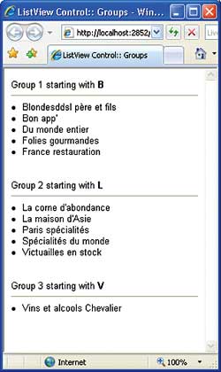
Figure 2: Grouping bound items in a ListView control
You can’t assign a group and use only the items that match some given criteria to come up with groups of different sizes. This is a technical limitation quite hard to overcome without resorting to a custom ListView control. Try debugging inside the source code of the CreateItemsInGroups method of the ListView class. Declared protected and virtual, the method could be overridden in a derived ListView class. However, its structure is too complex to be edited without having access to the source code. A lot of private methods and variables have to be manipulated in order to extend the rendering logic to conditional groups.
Let’s review the source code of the sample page in Figure 2. You start by adding a ListView handler for the ItemDataBound event. The event fires when the list view data item is being associated with the corresponding data record.
protected void ListView1_ItemDataBound(object sender,
	ListViewItemEventArgs e)
{
	if (e.Item.ItemType == ListViewItemType.DataItem)
	{
		ListViewDataItem currentItem = (ListViewDataItem) e.Item;
		CustomizeGroupHeader((ListView) sender, currentItem);
	}
}
You first check the type of the item being bound to data. This can only be DataItem – a value from the ListViewItemType enumerated type. A data item type is an instance of the ListViewDataItem class. The DataItem property on the currently rendered item references the data to be displayed.
void CustomizeGroupHeader(ListView root,
	ListViewDataItem currentItem)
{
	Customer cust = (Customer) currentItem.DataItem;
	:
}
The type of the data item depends on the data you have bound to the ListView control. In this case, I assume we have a collection of Customer objects bound to the ListView. As a result, an instance of the Customer class is the data object for item being rendered.
The next step entails getting a reference to the container of the group template. The ultimate purpose of this search is accessing the controls in the group template to modify the final user interface. Here’s how you get the ListView container:
Control container = currentItem.NamingContainer;
if (container == null) return;
Next, you search for a particular control in the group template:
Label groupHeader;
groupHeader = (Label) container.FindControl("groupHeader");
if (groupHeader == null) return;
Once you get it, all that remains to do is update the user interface.
groupHeader.Text = String.Format(
	"Group {0} starting with <b>{1}</b>", groupIndex + 1,
	cust.CompanyName.Substring(0, 1).ToUpper());
As mentioned, the ListView control doesn’t provide any ready-to-use information about groups. Amongst other things, you do not even know the index of the current group. The DisplayIndex property on the ListView class only indicates the index of the item being processed. However, because the size of each group is fixed – and stored by the GroupItemCount property – you can easily obtain the 0-based index of the current group. You track the index of the current group in a global variable, and whenever a new group is found, you update the header (see Figure 2).
In-Place Editing
The ListView control makes it easy to handle common data-driven operations such insert, update, and delete. You place buttons in the layout template, associate buttons with proper command names, and you’re done. Buttons can be global to the list (insert, sort, page) or specific of a particular item (update, delete). Command names are just strings that are assigned to the CommandName property of the Button control.As a developer, you are expressly required to define an edit and/or insert template which will be used to edit the contents of the selected item. Edit and insert templates are separate from one another and from the item template. If you bind the ListView control to a data source control then you can take advantage of the control’s full support for two-way data binding. You still use data binding expressions <%# … %> to bind to data but opt for the Eval method for read-only operations and the Bind method for full I/O operations. To turn the ListView user interface into edit mode, you need an ad hoc button control with a command name of Edit. A command name is a plain string that can be assigned to the CommandName property of a button control.
<asp:Button ID="Button1" runat="server"
	Text="Edit" CommandName="edit" />
When such a button is clicked, the ItemEditing event is raised. By handling this event, you can verify whether the operation is legitimate. If something comes up to invalidate the call, you set the Cancel property of the event data structure to abort the operation.
void ListView1_ItemEditing(object sender,
	ListViewEditEventArgs e)
{
	// Just deny the edit operation
	e.Cancel = true;
}
An edit item template wouldn’t be much help without at least a couple of predefined buttons to save and discard changes. You can define buttons using any kind of custom control that implements the IButtonControl interface; typically, a Button, LinkButton or perhaps an ImageButton. Any button clicking done within the context of a ListView control originates the ItemCommand server event. In the event handler, you use the CommandName property on the event data structure to check the requested command.
void ListView1_ItemCommand(object sender,
	ListViewCommandEventArgs e)
{
:
}
In addition, any clicking on buttons associated with predefined command buttons results in subsequent, and more specific, events. For example, ItemUpdating and ItemUpdated are fired before and after a record is updated. You can use these events to make last-minute checks on the typed data before the data is sent down to the database. Note that before the update is made, the ListView checks the validity of any data typed by calling the IsValid method on the Page class. If any validator is defined in the template it is evaluated at this time. Any update operation is conducted through the connected data source control. For update and delete operations, you need to identify the record uniquely. This is where the DataKeyNames property of the ListView control gets into the game. You use this property to define a collection of fields that form the primary key on the data source.
<asp:ListView ID="ListView1"
	runat="server"
	DataSourceID="ObjectDataSource1"
	DataKeyNames="id">
	:
</asp:ListView>
In this case, the DataKeyNames tells the underlying data source control that the ID field on the bound record has to be used as the key.
Paging
In ASP.NET, grid controls like GridView and DataGrid support data paging natively. Other iterative controls like Repeater and DataList leave the burden of pagination entirely on the developer’s shoulders. The ListView doesn’t have built-in paging capabilities, but knows how to work with a new control specifically designed to enable data paging on a variety of data-bound controls. This new control, introduced in ASP.NET 3.5, is the DataPager control.The DataPager never gets in touch with the underlying data source. All that it does is communicate to the paged control what is the next set of records to select and display. The DataPager is only responsible for displaying the user interface for pagination and for returning the interval of records to be retrieved by the paged control to be consistent with the pager’s user interface.
<asp:DataPager ID="DataPager1"
	runat="server"
	PagedControlID="ListView1"
	PageSize="4">
	<Fields>
		<asp:NextPreviousPagerField />
	</Fields>
</asp:DataPager>
The user interface for paging is not part of the control, but can be placed anywhere in the page and even driven through the query string of the container page. The user interface of the data pager control is largely customizable. You do that through a collection of DataPagerField objects. You have a pager field for next/previous pagination, numeric pagination, and a custom, template-based pager bar. Pager fields use several visual properties to set the style of buttons, companion text, and images to use instead of text.
The data pager control communicates with the paged control through an interface. Not all data-bound controls can be paged using a data pager. Only controls that implement the IPageableItemContainer interface can work with a data pager. Currently, the sole control to support this interface is the ListView control. You can create your own custom controls to implement the interface, however.
public interface IPageableItemContainer
{
	event EventHandler<PageEventArgs>
		TotalRowCountAvailable;
	void SetPageProperties(
		int startRowIndex,
		int maximumRows,
		bool databind);
	int MaximumRows { get; }
	int StartRowIndex { get; }
}
Whenever the pager is acted on, it invokes the SetPageProperties method on the paged control through the contracted interface. In doing so, it lets the ListView (or the paged control) know about the new start row to display and the size of the page.
Summary
The ListView combines the layout flexibility of a DataList or Repeater control with the power of two-way data binding of data source controls such as GridView and DetailsView. The ListView control can be used to implement virtually any reporting and publishing scenarios you can imagine. Its distinct layout template gives you total control over the HTML being generated and the style it must have. Various item templates (regular, alternate, edit, selected, insert) let you choose the markup to output for each possible state of the control. Finally, the ListView is pageable using an external pager control – the new DataPager control. ListView and DataPager controls are the only new server controls in ASP.NET 3.5, but they add functionality that was previously missing or implemented in a less than optimal way.Dino Esposito is the author of the two volumes Programming Microsoft ASP.NET 2.0 (Microsoft Press, 2005), and is a regular speaker at Bearpark’s annual Software Architect and DevWeek conferences.
Comments