Ed’s Note: This is an extract from Murach’s HTML5 and CSS3 by Zac Ruvalcaba and Anne Boehm. For Source Code, Sample Chapters, the Author Forum and other resources, go to http://www.murach.com/books/htm5/index.htm.
Many different types of mobile devices are in use today, and these devices are frequently used to access web sites. Because the screens on these devices are much smaller than standard computer screens, a web site that’s designed to be used on the desktop can be difficult to work with on a mobile device. To accommodate mobile users, then, web developers typically provide pages that are designed specifically for mobile devices.
How to provide pages for mobile devices
[There are] five ways to provide web pages for mobile devices. To start, you can use a style sheet for the “ handheld ” media type. Unfortunately, that media type is considered antiquated and not all mobile browsers recognize it. That includes the Safari browser used by Apple’s iPhone, current versions of the Opera Mobile and Opera Mini browsers, and others. These browsers support the standard screen media type instead of the handheld type.
On the other hand, iPhone’s Safari and other mobile browsers including Opera’s Mobile and Mini browsers do support a new feature of CSS3 called media queries. These queries let you use a conditional expression for a media type. If, for example, the maximum screen width for a mobile device is 480 pixels, you can code a link element like this if you want to use a different style sheet for those devices:
<link rel="stylesheet" href="styles/mobile.css"
       media="only screen and (max-device-width: 480px)">
Then, you can code another link element for screen media with a minimum screen width of 481 pixels. The style sheet for this element would then be used for standard computer screens.
The next technique requires that you develop a separate web site for mobile devices. When you use this technique, you include a link on the home page that lets the user switch to the mobile version of the site. The trouble with this is that users don’t always enter a site at the home page, so you may need to provide links to the mobile site on other pages.
When you use the last three techniques, the web site detects when a mobile device is being used and then redirects the user to the mobile version of the site automatically. This is what is done on most commercial web sites that service many mobile device users. For these sites, one common convention for the mobile site name is to precede the domain name for the main site with m and a period as in m.yahoo.com.
To detect a mobile device, a web site can use JavaScript on the client, a scripting language on the server, or WURFL on the server. Because this book isn’t about JavaScript or server-side programming, though, these techniques aren’t presented in this book. Instead, this chapter shows you how to develop the web pages for a mobile web site, which you need to learn how to do no matter how the user gets to that site.
Define a style sheet for mobile devices
- One way to define a style sheet for mobile devices is to set the media attribute in the link element to “handheld”. However, many mobile browsers don’t recognize this media type.
- CSS3 provides a new feature called media queries that gives you more control over the style sheet for a web page. The downside is that older browsers don’t support this feature so this technique isn’t backward compatible. For more information, see http://www.w3.org/TR/css3-mediaqueries/.
Include a link to a mobile version of the web site
- When you use this technique, you display the desktop version of the web site no matter what device accesses it. Then, you include a link to a mobile version of the site near the top of the home page.
Use JavaScript to detect mobile devices and redirect
- When you use this technique, you use JavaScript to detect mobile devices. Then, if a mobile device is detected, the user is redirected to the mobile version of the web site.
- The problem with this is that there are so many different mobile devices that it’s difficult to detect them all. Also, some mobile devices don’t support JavaScript.
Use a server-side scripting language to detect and redirect
- With this technique, you use a server-side scripting language such as PHP to detect mobile devices. To do that, the script looks at the web browser that made the request to see if a mobile device is being used. If so, the user is redirected to the mobile version of the web site.
- The problem with this is that there are so many mobile browsers that it’s difficult to detect them all.
Use the WURFL to detect mobile devices
- The WURFL is an XML configuration file that contains information about a variety of mobile devices, including the features and capabilities they support. This file is updated frequently with new devices.
- To use the WURFL, you implement the API (Application Programming Interface) using languages such as Java, PHP, C++, or C#.NET. This API lets you determine the browser that’s being used and then retrieve information about that browser from the XML file. When you use this technique, you have to download the XML configuration file periodically so it’s up-to-date.
Description
- At present, the best way to provide for mobile devices is to redirect the user to a mobile version of the main web site. That can be done by providing a link to the mobile version or by automatically detecting mobile devices and redirecting them to that version.
- To detect mobile devices, you can use the last three techniques above. However, these techniques aren’t illustrated in this chapter. Instead, this chapter assumes that you’ll provide a link to a mobile version of your web site.
How to set the viewport properties
When you develop a web site for mobile devices, you can use a special meta element that lets you configure a device’s viewport . This meta element is presented in [Listing] 15-2.
To start, you should know that the viewport on a mobile device works differently from the viewport on a computer screen. On a computer screen, the viewport is the visible area of the web page. However, the user can change the size of the viewport by changing the size of the browser window.
In contrast, the viewport on a mobile device can be larger or smaller than the visible area and determines how the page content appears in that area. In this figure, for example, you can see that the first web page is displayed so almost all of the width of the page is visible. In contrast, the second web page extends beyond the visible area of the screen. Because this display is larger, however, it’s easier to work with.
To configure the viewport, you use a meta element with the name attribute set to “viewport ” . Then, for the content attribute, you can specify any of the properties listed in this figure to set the dimensions and scaling of the web page within the mobile device.
The two coding examples in this figure illustrate how this meta element works. The first example sets the width of the viewport to the width of the mobile device. You can use this setting if a page is wider than the device width but narrower than the default viewport width. Then, the page will be enlarged so it fills the visible area. Because this example also sets the user-scalable property to “ no” , the user can’t zoom in or out of the page.
The second example shows the code that is used for the pages in the rest of this chapter. Here again, this example sets the width of the viewport to the width of the mobile device, but it also sets the zoom factor, or scale, for the viewport. In this case, this scale is set to 1, which represents the default width for the viewport. For the iPhone, that means the viewport width is set to 320 pixels.
If you want the viewport to appear to be larger or smaller, you can change the initial scale to a value that is higher or lower than 1. This is illustrated by the two screens in this figure. Since the HTML for the first screen doesn’t include a viewport meta element, its initial scale is 1 and the content for this full screen is small. For the second screen, though, a meta element sets the initial scale to .5. As a result, a smaller portion of the page is shown on a mobile device, but what’s shown is easier to read because it’s larger.
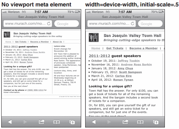
Figure 15-1. A web page on an iPhone before and after scaling
Content properties for viewport metadata
| Property | Description |
|---|---|
| width | The width of the viewport in pixels. You can also use the device-width keyword to indicate that the viewport should be as wide as the screen. |
| height | The height of the viewport specified in pixels. You can also use the device-height keyword to indicate that the viewport should be as tall as the screen. |
| initial-scale | A number that indicates the initial zoom factor that’s used to display the page. |
| minimum-scale | A number that indicates the minimum zoom factor for the page. |
| maximum-scale | A number that indicates the maximum zoom factor for the page. |
| user-scalable | Indicates whether the user can zoom in and out of the viewport. Possible values are yes and no. |
Listing 15-2. Meta elements that set viewport properties
<meta name="viewport" content="width=device-width, user-scalable=no">
<meta name="viewport" content="width=device-width, initial-scale=1">
Description
- The viewport on a mobile device determines the content that’s displayed on the page. It can be larger or smaller than the actual visible area of the screen.
Guidelines for designing mobile web pages
If you create web pages specifically for mobile devices, you should follow some general guidelines so it’s easy for users to work with those pages.
In general, you want to simplify the layout and content of your pages. This is illustrated by the two pages in this figure. The first shows the home page for the mobile version of a large web site. Here, the page consists primarily of links to the major types of products that the site offers. The second page shows how the page for one product has been simplified. If you review the full version of this site, you’ll get a better idea of just how much the full version has been simplified.
Guidelines for testing mobile web pages
Because there are so many different mobile devices, it’s important to test a mobile web page on as many devices and in as many browsers as possible. Although the best way to test a mobile web page is to deploy the page on a web server and then display it on a variety of devices, that isn’t always possible. In that case, you may want to use the device emulators and browser simulators that are available for many of the mobile devices and browsers.
In most cases, you need to download the required emulator or simulator from the manufacturer’s web site so you can run it on your desktop. In a few cases, though, you can run the emulator or simulator online. To do that, though, you sometimes need to deploy the web page so it can be accessed online. Also, when you use an emulator or a simulator, it may not always provide accurate results, although it should approximate what a page will look like.
To capture the screens for this chapter, I used my iPhone. To do that, I first deployed the pages to my web server. Then, I used the Safari browser on my iPhone to display the pages. To capture each page image, I held down the Home button and pressed the Power button. After I captured all of the page images, I copied the images from my iPhone to my computer.
If you don’t have a web server that you can deploy the mobile pages on, one easy option is to size your browser window so it’s about the size of a mobile device. That will give you a good idea of what the pages will look like on a mobile device. Another option is to use the iPhone simulator that’s available at www.testiphone.com.
With this simulator, you can paste the location of a page on your computer into the address bar and click the Refresh button to display the page.
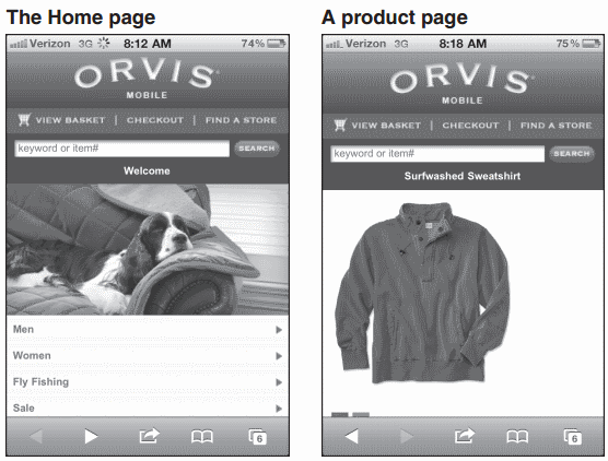
Two pages from the mobile web site for www.orvis.com
Guidelines for designing mobile web pages
- Keep your layout simple so the focus is on the content. One-column layouts typically work best.
- Include only essential content.
- Keep images small and to a minimum.
- Avoid using Flash. Most mobile devices, including the iPhone don’t support it.
- Include only the essential navigation in the header of the page. The other naviga-tion should be part of the content for the page.
- Make links and other elements large enough that the user can easily manipulate them.
- Use relative measurements so the page looks good regardless of the scale.
Guidelines for testing mobile web pages
- Test all pages on as many different mobile devices and in as many different mobile browsers as possible.
- The best way to test mobile web pages is to deploy them to your Internet server and test them on the devices themselves.
- When you can’t test your pages on the devices themselves, you can use device emulators and browser simulators.

Comments