However, from time to time you will still need to create your own custom controls. This article will show you how to create Silverlight 2 controls so that they enable a designer to update their appearance without requiring a developer to modify their code.
Background
Historically, a Windows developer had to assume responsibility for both a control’s appearance as well as its functionality. The developer would use GDI (or latterly GDI+) to render the control’s appearance in response to a Windows WM_PAINT message. This approach has drawbacks, not the least of which is that changing the appearance of a control requires a developer to hack out some new code; and let’s be honest, most developers are somewhat limited in the graphic skills department.The emergence of the Web’s HTML model reaffirmed the importance of good graphical design, which is further expanded when you factor in the use of cascading style sheets (CSS) to enable a designer to apply “visual refactoring”, making boring HTML spring to life with visual goodness.
Windows Presentation Foundation (WPF) took this separation to a completely new level, with the introduction of “lookless” controls. Lookless controls enable a developer to work on the functionality of a control, whilst a “user experience” (UX) designer can use tools such as Adobe Illustrator or Microsoft Expression Design, in conjunction with Microsoft Expression Blend, to create a stunning visual experience.
WPF achieves this separation by using two critical components:
- Templates, which define the default set of visual elements that will be used to compose the control’s appearance, and
- Triggers, which enable a UX designer to alter the appearance of those visual elements depending on either events that are raised or the value of properties on the control.
Silverlight and lookless controls
The benefits of lookless controls are so significant that it came as quite a shock to find that triggers were not included when Silverlight 2 was released. Instead, Silverlight 2 introduces a newer, more simplified approach known as the “parts and states” model to achieve similar lookless control behaviour as that offered by WPF.This model is the recommended approach to building custom controls for Silverlight 2, so without further ado let’s look at how you might use it to build a control.
A zoom control
Virtually every WPF (and thus Silverlight) application has a zoom feature somewhere in its user interface. Even Visual Studio 2008 has a zooming capability in its XAML designer, via a Zoom control shown in Figure 1.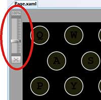
Figure 1: The Visual Studio 2008 zoom control
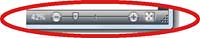
Now let’s consider Microsoft PowerPoint 2007 for a moment. It also has zooming capability, as shown in Figure 2.
Figure 2: PowerPoint’s control
Are the two controls the same? Indeed they are, so let’s see how you’d build this in Silverlight as a custom control.
Custom or user control?
Silverlight supports two common types of control: custom and user controls. So which should you use to implement the Zoom control? Historically user controls have been built using composition, offering a design surface for placing child controls with a “code beside” class (using partial classes) where the code for the control is placed. The critical thing here is that the visual aspects of the user control are fixed and cannot be altered, other than through the use of styles.Silverlight follows this same approach with its user controls, which immediately precludes you from using a user control in this case, as it is clear that there are at least two different visual layouts that are required.
Silverlight custom controls, on the other hand, follow a template-based approach, whereby designers can create their own visual elements to be displayed by the control. Whenever you are creating a control where you want to allow a designer to alter the layout and appearance of visual elements on an ad hoc basis you should use a custom control.
Consequently, a custom control is the correct approach to take with the Zoom control, as we already know that it can have two very different appearances.
Understanding the parts model
Let’s start off by analysing the Zoom control from the perspective of the developer who has to implement the code. You can imagine that the specification for the control might contain the following requirements:- The control should expose a ZoomFactor property that reflects the amount of zooming that should be applied.
- The control should raise a ZoomFactorChanged event that should be raised whenever the ZoomFactor is changed.
- Moving a slider (or scrollbar) should alter the ZoomFactor property and thus raise the ZoomFactorChanged event.
- Clicking a “zoom to fit” button should alter the ZoomFactor property to a well-known value that lies outside of the constrained value (perhaps -1, for example) to indicate that the UI should zoom to fit.
- The control should display the current ZoomFactor in a textual format, such as “10%” for small scaling factors and “15x” for the larger factors.
However, this is truly the critical learning point for the parts model: the requirements drive the functionality and aspects of the visual appearance. In order to meet these requirements, the developer will be typically have to add event handlers to (requirements 3 & 4), or set properties on (requirement 5), visual elements.
These visual elements will be the named parts, which the developer will code against and the designer is supposed to provide in the control’s template.
Parts on the Zoom control
In this case, we can see that three parts should be present, namely:- A slider or scrollbar that is used to set the zoom factor,
- A label that displays the current zoom factor, and
- A button that can be clicked to perform a “zoom to fit” facility
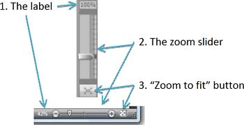
Figure 3: One control, two appearances
Defining the custom control
Silverlight custom controls require two things: the implementation code and a default template that defines the visual appearance. At run-time, when an instance of the control is instantiated, Silverlight will locate the template and create a matching set of visual elements as the UI for the control.The default control template must be specified in a XAML file named generic.xaml, which must itself be included as a resource in the assembly. Just as importantly, for compatibility with WPF, generic.xaml must also be placed in a folder named themes. In the majority of cases, you will also want to place your custom controls in separate Silverlight class library assemblies, so that you can reuse them across multiple projects. Figure 4 shows the basic project structure for the Zoom control.
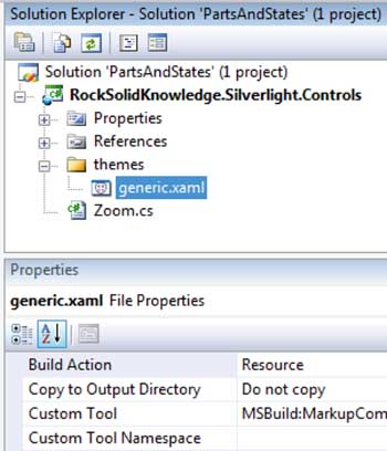
Figure 4: The basic project structure
The content of generic.xaml is shown in Listing 1, which is fairly chunky, so let’s work through it.
Listing 1: The template for the Zoom control
<ResourceDictionary
	xmlns="http://schemas.microsoft.com/winfx/2006/xaml/presentation"
	xmlns:x="http://schemas.microsoft.com/winfx/2006/xaml"
	xmlns:local="clr-namespace:RockSolidKnowledge.Silverlight.Controls">
	<Style TargetType="local:Zoom">
		<Setter Property="Template">
			<Setter.Value>
				<ControlTemplate TargetType="local:Zoom">
					<Border Padding="3" MinWidth="50"
						Background="AliceBlue" BorderThickness="2"
						CornerRadius="4" BorderBrush="LightSteelBlue">
						<Grid x:Name="root">
							<Grid.RowDefinitions>
								<RowDefinition Height="Auto" />
								<RowDefinition Height="*" />
							 <RowDefinition Height="Auto" />
							</Grid.RowDefinitions>
							<Border Background="LightSteelBlue" CornerRadius="3">
								<TextBlock HorizontalAlignment="Center" x:Name="lblAmount" />
							</Border>
							<Slider Margin="0,4" MinHeight="100" Grid.Row="1"
								Orientation="Vertical" x:Name="sldZoom"
								Minimum="0" Maximum="100" />
							<Button Grid.Row="2" x:Name="btnFit" Content="X" />
						</Grid>
					</Border>
				</ControlTemplate>
			</Setter.Value>
		</Setter>
	</Style>
</ResourceDictionary>
To start with, generic.xaml contains a standard ResourceDictionary and nothing else. Inside this resource dictionary you define a Style that for the control for which you want to set a default template. Note that this Style does not have a key associated with it. Instead, Silverlight will use the Style’s TargetType attribute as the key: this is set to the Zoom class that is defined in the RockSolidKnowledge.Silverlight.Controls namespace.
Inside the Style is a single property setter, which is used to set the control’s ControlTemplate. The ControlTemplate represents the visual tree that will be built, by default, for each instance of the Zoom control.
The ControlTemplate contains a number of elements, some of which are named. Specifically, these are the TextBlock, Slider and Button controls that are required by the developer to implement the functionality. It is these named elements that are the parts in the “parts and states” model.
Mapping the template
It’s now time to see how Silverlight loads in the control template. The initial code for the Zoom control is:namespace
RockSolidKnowledge.Silverlight.Controls
{
public class Zoom : Control
{
public Zoom()
{
DefaultStyleKey = typeof(Zoom);
}
}
}
The most important thing to note in this listing is the setting of the DefaultStyleKey property to refer to the Zoom class’ type object. This critical line ensures that the style defined in generic.xaml is applied to this control by default, which thus in turn applies the template.
With this code in place, you can now build the class library and place a Zoom control onto a page using the following XAML:
<rsk:Zoom xmlns:rsk="clr-namespace:
RockSolidKnowledge.Silverlight.Controls;
assembly=
RockSolidKnowledge.Silverlight.Controls"
/>
This yields the UI as seen in Figure 5.
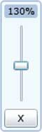
Figure 5: The Zoom control in action
Applying the template
Connecting up to the parts is done in an override that you provide on the OnApplyTemplate method, which is called as Silverlight applies the template to the control.So how do you go about doing this? Listing 2 provides an example that focuses on just one of the parts: the slider that is used to set the zoom factor.
Listing 2: Applying the template
public class Zoom : Control
{
	private RangeBase _rbZoom;
	public override void OnApplyTemplate()
	{
		ZoomSlider = GetTemplateChild("sldZoom") as RangeBase;
		// repeat for other named parts
	}
	private RangeBase ZoomSlider
	{
		get { return _rbZoom; }
		set
		{
			if( _rbZoom != null )
			{
				_rbZoom.ValueChanged -= ZoomValueChanged;
			}
			_rbZoom = value;
		if( _rbZoom != null )
		{
			_rbZoom.ValueChanged += ZoomValueChanged;
		}
	}
	private void ZoomValueChanged(
		object sender,RoutedPropertyChangedEventArgs<double> e )
	{
		// code elided for clarity, but it updates the
		// ZoomFactor property
		...
	}
	// DisplayLabel and ToFitButton properties not shown but
	// are implemented similarly to ZoomSlider.
	// Rest of the code elided for clarity
	...
}
There are a number of items of interest in Listing 2, so let’s look at them now. The GetTemplateChild method is used to obtain a reference to the named parts, which are then stored in properties (and thus ultimately in fields). This allows the developer to get a reference to each of the visual elements so that they can add event handlers, set properties and so forth as needed. All named parts will have a matching field/property, although for brevity only one of these is shown in Listing 2. It’s also good practice to encapsulate the setting of event handlers into a property, as shown for the ZoomSlider, as it ensures that handlers are appropriately added and removed whenever the property is set.
You must code defensively, as it is perfectly acceptable for a UX designer to apply a custom template that is missing some parts. The code in Listing 2 uses the C# “as” casting technique to safely assign null values into the properties if a named template part is missing, with copious amounts of null checking inside the properties themselves. Clearly, a control isn’t going to function as well as it would do if all of the parts were present, but the control shouldn’t blow up as a result of a named part not being present. You should also be aware that the template might contain lots of parts that are not named. For example, the developer isn’t interested in the Border elements that are defined in the template, as there is no need to manipulate them from code.
Finally, it is important to understand that the types defined in the default template won’t necessarily match precisely to their matching properties/fields. Instead, as a developer, you try to use the highest-level base class that you can for the field for any named part. In the Zoom control we use a RangeBase in code but a Slider in the default template. This is because in the code we’re only interested in the Value (and perhaps Minimum and Maximum) property, and the ValueChanged event of the slider. By using RangeBase, where these members are defined, a UX designer can fold in a Slider, a ScrollBar or any other control that derives from RangeBase in their own templates.
Specifying the named part requirements
The point of the parts model is to allow a developer to specify which parts the UX designer should provide in any custom template that they create. Ideally, this should be done in such a way that tooling such as Expression Blend can validate the template that is being created. This is achieved by applying the TemplatePart attribute to the control class:[TemplatePart(Name = "sldZoom",
Type = typeof(RangeBase))]
[TemplatePart(Name = "lblAmount",
Type = typeof(TextBlock))]
[TemplatePart(Name = "btnFit",
Type = typeof(ButtonBase))]
public class Zoom : Control
{
// class content elided for clarity
...
}
As you can see from this listing, the TemplatePart attribute lets you specify the name of the part and its allowed base type. Note how these match the names and types used in the calls to GetTemplateChild in Listing 2.
Remember, the primary reason for creating lookless controls is to allow a UX designer to alter the appearance of the control without having any impact on the functionality. Figure 6 shows an example of this using Expression Blend.
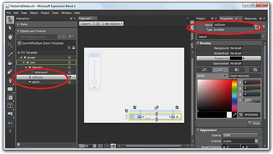
Figure 6: Customising the template
A new Zoom control has been added to a page, but its template is being altered to reflect the layout from Microsoft PowerPoint. Note how the designer has replaced the Slider from the original template with a ScrollBar, but has ensured that the parts have the same names (lblAmount, sldZoom and btnFit) as those originally defined by the control’s author.
Wrapping up the parts model
So the parts portion of the “parts and states” model is a mechanism that allows a developer to specify, using the TemplatePart attribute, what parts a custom control’s template should contain. The developer can then connect event handlers up to the named parts during the overridden OnApplyTemplate method, and then further manipulate the parts as and when appropriate depending on the actions on, and state of, the control.The developer, or more likely a UX designer, should also create a default template (that is applied via a Style). UX designers can then create their own templates that are applied to instances of the custom control, altering their appearance. Assuming that the designer is smart enough to provide parts with compatible types and matching names to those specified by the developer, they could create a completely different-looking control that provides identical functionality to that originally created by the developer, but without requiring any code to be modified. Perfect.
So you’ve now got a good handle on the parts model, so what is the “states” portion all about? It’s time to look at that now.
Visual states
Consider a simple Button control. It has a number of different visual states, some of which are shown in Figure 7.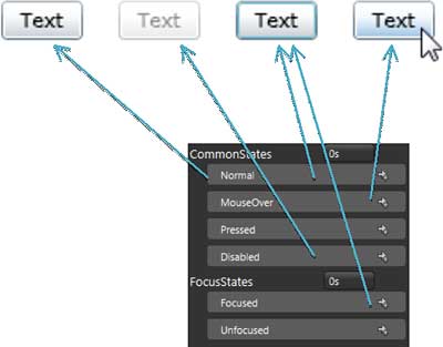
Figure 7: Buttons in various states
You might also notice that the states have been divided into two groups: CommonStates and FocusStates. States within a group are mutually exclusive, so that a Button can’t be in both the Normal and MouseOver states, for example. However, as you can see from Figure 7, it is perfectly possible for a Button to be in both the Normal and Focused states.
This concept of visual states is nothing new, but it does raise some interesting questions, namely:
- Who is responsible for defining the states?
- Who is responsible for putting the control into that state?
- Who is responsible for the appearance of the control in any state?
Given that there is a clean separation of responsibilities between the two roles, albeit that there should be plenty of communication, it implies that there must be a middleman that both developer and designer utilise. In Silverlight, this is the Visual State Manager (VSM).
Introducing Visual State Manager
In its simplest form, VSM allows a developer to place a control into a specific visual state using a single line of code:VisualStateManager.GoToState( this, "MouseOver", true);The first parameter identifies the control whose state is being set; the second parameter is the name of the state; and the third parameter is used to indicate whether a transitional animation should be used. As you can see, it is easy to imagine that the developer would call the above line of code in response to, say, a MouseEnter or MouseLeave event occurring on the control. Of course, the developer needs to advertise the states (and groups of states) that their control supports. Similarly to the way that a TemplatePart attribute was used to advertise the parts, TemplateVisualState attribute is used to identify the different visual states.
This is as simple as:
[TemplateVisualState(GroupName=
	"CommonStates", Name="MouseOver" )]
public class Zoom : Control {
	...
}
So what is a VisualState? It’s really nothing more than a standard Silverlight animation, which is run whenever VisualStateManager.GoToState is called. These VisualState animations are stored as a part of the control’s template. One of the most common things to animate in a visual state is the Opacity property of an element. This technique allows you to hide/display a focus border, or overlay an element with a partially transparent shape to represent a disabled state.
So with this in mind, let’s consider our Zoom control again. If you’ve experienced the zoom control in Visual Studio, you’ll notice that it is partially transparent until the user moves the mouse over it. It thus has two distinct and exclusive visual states: Normal and MouseOver.
The code in Listing 3 demonstrates how this is achieved.
Listing 3: Implementing visual states
<ControlTemplate TargetType="local:Zoom">
	<Border Opacity="0.4" x:Name="border" ...>
 		<vsm:VisualStateManager.VisualStateGroups>
			<vsm:VisualStateGroup x:Name="CommonStates">
				<vsm:VisualState x:Name="Normal" />
				<vsm:VisualState x:Name="MouseOver">
					<Storyboard>
						<DoubleAnimationUsingKeyFrames
							BeginTime="00:00:00"
							Duration="00:00:00.0010000"
							Storyboard.TargetName="border"
							Storyboard.TargetProperty=
								"(UIElement.Opacity)">
							<SplineDoubleKeyFrame
								KeyTime="00:00:00" Value="1"/>
						</DoubleAnimationUsingKeyFrames>
					</Storyboard>
				</vsm:VisualState>
			</vsm:VisualStateGroup>
		</vsm:VisualStateManager.VisualStateGroups>
<!-- Template visual elements elided for clarity -->
		...
	</Border>
</ControlTemplate>
As you can see, the template has been adjusted so that it has a default Opacity of 0.4 for the root Border element. This is named (but not a named part) so that the Storyboard in the MouseOver VisualState can adjust that Opacity value up to 1. The code to activate these visual states is shown in Listing 4.
Listing 4: The code that drives the visual states
[TemplateVisualState(GroupName="CommonStates",
	Name="MouseOver")]
[TemplateVisualState(GroupName="CommonStates", Name="Normal")]
public class Zoom : Control
{
	public override void OnApplyTemplate()
	{
		... // calls to GetTemplateChild() elided
		MouseEnter += OnMouseEnter;
		MouseLeave += OnMouseLeave;
	}
	public bool IsMouseOver
	{
		get { return (bool)GetValue(IsMouseOverProperty); }
		set { SetValue(IsMouseOverProperty, value); }
	}
	public static readonly DependencyProperty
		IsMouseOverProperty =
		DependencyProperty.Register("IsMouseOver",
		typeof(bool), typeof(Zoom),
		new PropertyMetadata(false, IsMouseOverChanged ));
	static void IsMouseOverChanged(DependencyObject dobj,
		DependencyPropertyChangedEventArgs e)
	{
		Zoom zoom = dobj as Zoom;
		if (zoom != null)
		{
			zoom.UpdateVisualState(true);
		}
	}
	private void UpdateVisualState(bool useTransitions)
	{
		if (IsMouseOver)
		{
			VisualStateManager.GoToState(this, "MouseOver",
				useTransitions);
		}
		else
		{
			VisualStateManager.GoToState(this, "Normal",
				useTransitions);
		}
	}
	void OnMouseLeave(object sender, MouseEventArgs e)
	{
		IsMouseOver = false;
	}
	void OnMouseEnter(object sender, MouseEventArgs e)
	{
		IsMouseOver = true;
	}
	// Other code elided for clarity
	...
}
Don’t be daunted by Listing 4, as it’s all remarkably straightforward Silverlight code. To begin with, I’ve added a simple Boolean DependencyProperty (DP) named IsMouseOver. The value for this is toggled in handlers for the MouseEnter and MouseLeave events, which are hooked in the OnApplyTemplate method. The IsMouseOver DP has a property change handler, which calls the private UpdateVisualState method. This method is a centralised place for setting the visual state for the control.
Now this might seem to be an excessive amount of code. After all, I could have called GoToState directly in the MouseEnter and MouseLeave event handlers. However, you will find that this pattern of implementation, with a centralised method for setting the visual state that reads the value of properties, will scale well when you’re developing a complex control with many states that are activated from many event handlers.
Transitions
You might have noticed that the timeline in Listing 3 has an incredibly short duration. Instantaneous transitions tend to be visually unappealing, so it would be better to provide a slightly longer animation. You could alter the duration for each animation, but there’s an easier solution: transitions.Figure 8 shows Blend’s excellent transition editor.
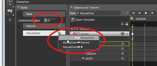
Figure 8: Designing transitions
You can either set a global transitional duration (in this case 0.2s) that applies to transitions between all the states, or you can set individual transitions for each state. Note that the * represents a transition to or from any other state. The transitions are stored in the XAML as shown below:
...
<vsm:VisualStateManager.VisualStateGroups>
	<vsm:VisualStateGroup
		x:Name="CommonStates">
		<vsm.VisualStateGroup.Transitions>
			<vsm:VisualTransition
				GeneratedDuration="0:0:0.2" />
		</vsm:VisualStateGroup.Transitions>
		<vsm:VisualState x:Name="Normal" />
		...
	</vsm:VisualStateGroup>
</vsm:VisualStateManager.VisualStateGroups>
...
These durations are applied to the timelines when the final parameter of GoToState is set to true.
Wrapping up the states model
Visual states are a great way for developers and designers to manage the appearance of a control. The developer (normally in conjunction with a designer) decorates the control with the TemplateVisualState attribute to indicate which states a control can be in. These can be grouped to enable a control to be in multiple states simultaneously. The developer then uses the VisualStateManager to set the visual state of their control, typically in response to events that occur on the control. The UX designer can use Expression Blend to create animations that can update the appearance of the elements that make up the control’s UI. These animations are invoked in response to the developer calling GoToState. Finally, transition durations can be applied that alter the running time of the animations, potentially on a specific state-to-state basis.A few final thoughts
Throughout this article, I’ve attempted to draw a clear dividing line between the developer and the UX designer, but it’s very common for them to be one and the same person. Which is fine, as long as you remember to separate visual appearance from functionality, using the techniques presented in this article. I’ve also stressed that it is the developer who names the parts and defines the visual states. While this is true up to a point, it’s critically important that the developer works with the UX designer (or at least thinks like a designer), so that they accommodate the visual requirements for the control.For example, our Zoom control has no Focused state so it is impossible for a UX designer to change its appearance to show that the control has, indeed, got the focus. The only option would be to involve a developer to respond to events and have those handlers alter the appearance, probably via derivation, which is a huge retrograde step, and something to be avoided. This dependence on developers defining states is one of the weaknesses of the states model, particularly in comparison to WPF’s support for triggers. However, the excellent support in Expression Blend, plus the lightness of the model, more than makes up for it as long as the controls are well implemented.
Finally, it’s tempting to think that controls require lots of named parts. It might come as a shock, but controls such as Button, RadioButton and CheckBox actually have NO named parts. They do, however, have many visual states. This actually makes a lot of sense when you think about it, as these controls all depend on being clicked, but we don’t actually care which part of the control is clicked. Therefore, the various Mousexxx event handlers are added to the control itself, not to any named part in the control. The rich number of visual states, however, allows designers to create CheckBoxes that look like electrical switches and Buttons that support interesting rollover effects.
Conclusion
Silverlight’s “parts and states” model is an incredibly effective and simple way to create re-usable, lookless controls. Named parts allow a developer to connect the internal behaviours for the control up to the visual elements that the UX designer provides. Visual States and VSM provide a mechanism for the UX designer to alter the appearance of a control based on states that are set by the developer in response to events on, and the internal state of, the control.If you would like to see a step-by-step video that takes you through the entire process of building the Zoom control, along with all the code from this article, check out the screencasts.
Dave Wheeler is a developer, consultant and trainer who specialises in the various UI technologies of Microsoft .NET. He is a founding director of Rock Solid Knowledge Ltd, an independent .NET consultancy, and co-author of DevelopMentor’s Essential Silverlight.
Comments